BURYHOOK TIMBER
REBRAND | SOCIAL MEDIA | APPAREL | WEBSITE | STATIONERY

PROJECT SUMMARY
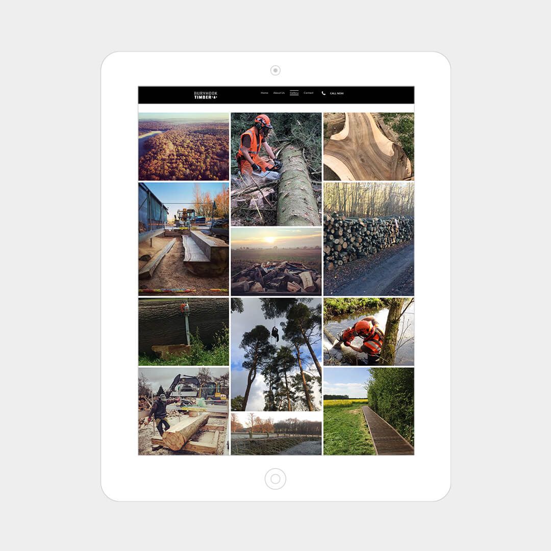
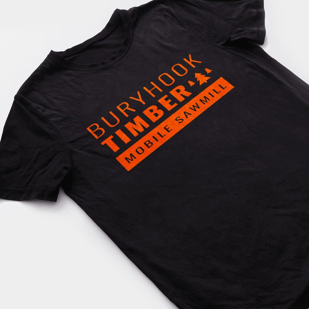
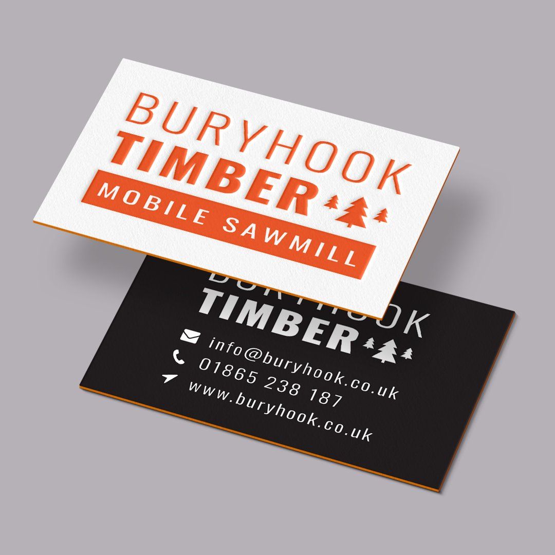
A punchy new brand identity was created resulting in a more impactful look and feel. Moving away from the original brown logo, a vibrant orange was chosen to represent the hue of cut timber; this coupled with the frequent use of black and white 'on the job' photography really set the brand apart from its competitors. The new look was launched across both print and digital plartforms.
CLIENT FEEDBACK
"
Fairbank Design did a fantastic job with our rebranding. Super helpful and produced a great package for Buryhook Countryside Management!"
KAVIN RING, BURYHOOK COUNTRYSIDE MANAGEMENT
RELATED PROJECTS