FLOWER YOGA
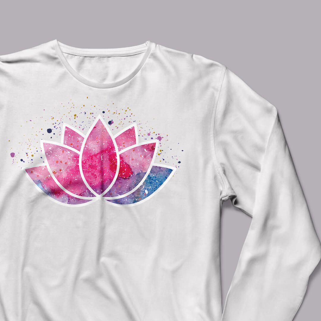
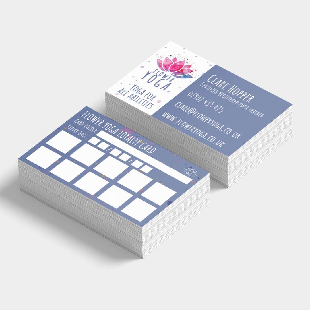

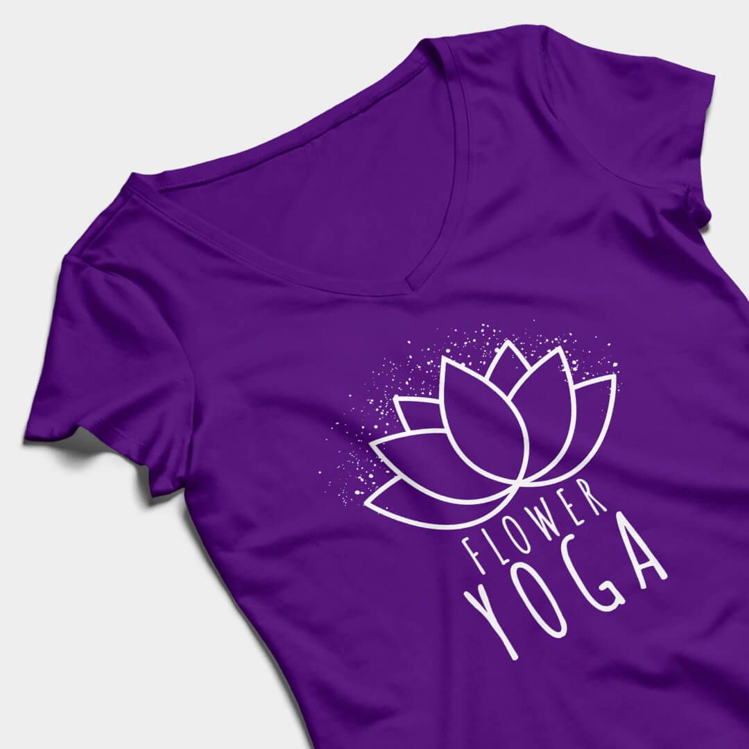
A new logo along with updated digital and print materials formed the basis of a full rebrand for Flower Yoga. I was briefed to include a flower graphic within the logo, so it would connect with the business name. A range of concepts were presented to the client so they could pick one that suited their individual style. Pink, purple and blue tones were used in the brand to convey a sense of calm and tranquillity.
"
Victoria is an extremely gifted and thorough graphic designer. She designed my yoga business logo and went on to also design my website. We sat down together, discussed what I was looking for in regards to colours and designs, and she created a logo which beautifully represents the business and my personality very well indeed.
Victoria’s attention to detail is beyond compare, there was no part of the design process that she believed was any less important and deserved less attention. If there was anything that I needed changed or added then nothing was too much trouble. When I needed the colour logo changed to a simple white for fabric printing, the altered logo was in my inbox by the end of the day. Which leads me to say how patient Victoria is also.
Victoria has an exceptional ability to create the most stunning graphics and websites, I cannot praise her enough. Over two years on, I am still receiving compliments about the website and design and always point them in her direction."
CLARE HOPPER, FLOWER YOGA
RELATED PROJECTS